| Discussion Forum: Thread 234309 |
|
 |
| | | Author: | Pazzo  | | Posted: | Mar 28, 2018 15:13 | | Subject: | Move header buttons to the left side screen | | Viewed: | 105 times | | Topic: | Suggestions | | Status: | Open | | Vote: | [Yes|No] | |
|
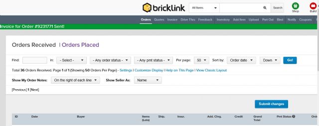
| Hi all,
when I am in my order page...all buttons are centered above the site.
But using an old fashioned 4/3 monitor, half of the buttons are outside my view,
and I need to use the sliding bars everytime I want to select one of them.
If all the buttons can be alligned from the left side of the screeen, this would
improve a lot.
Anybody has the same problem?
Be cool and have fun
Eric
|
|
|
| | | | | |
| | | | | Author: | picabo | | Posted: | Mar 28, 2018 15:15 | | Subject: | Re: Move header buttons to the left side screen | | Viewed: | 30 times | | Topic: | Suggestions | |
|
| In Suggestions, Pazzo writes:
| | Hi all,
when I am in my order page...all buttons are centered above the site.
But using an old fashioned 4/3 monitor, half of the buttons are outside my view,
and I need to use the sliding bars everytime I want to select one of them.
If all the buttons can be alligned from the left side of the screeen, this would
improve a lot.
Anybody has the same problem?
Be cool and have fun
Eric
|
Yes exactly the same as you and it's annoying.
|
|
| | | | | |
| | | | | Author: | picabo | | Posted: | Mar 28, 2018 15:16 | | Subject: | Re: Move header buttons to the left side screen | | Viewed: | 26 times | | Topic: | Suggestions | |
|
| In Suggestions, Pazzo writes:
| | Hi all,
when I am in my order page...all buttons are centered above the site.
But using an old fashioned 4/3 monitor, half of the buttons are outside my view,
and I need to use the sliding bars everytime I want to select one of them.
If all the buttons can be alligned from the left side of the screeen, this would
improve a lot.
Anybody has the same problem?
Be cool and have fun
Eric
|
I can see it all if I bring the zoom down to 80% but, then of course, I can't
read anything.
Pam
|
|
| | | | | |
| | | | | Author: | Teup | | Posted: | Mar 28, 2018 18:47 | | Subject: | Re: Move header buttons to the left side screen | | Viewed: | 27 times | | Topic: | Suggestions | |
|
| I agree it's way too wide. I have a large widescreen but even here "current
orders" and "filed orders" is off the screen. What you can at least do for those
two particular options (and perhaps others) is bookmark their links and add them
to your bookmark bar of your browser, so you can access them by clicking there
instead of having to scroll right.
I think before improving the interface, first of all a bug needs to be fixed.
This orders received display is way too wide because of all these columns. And
we cannot turn off columns such as additional charges, additional charges 2,
and insurance. I've never used insurance yet it takes up the center of the
display. These columns used to be mandatory for some mysterious reason and their
checkboxes were greyed out in "customize display", but now they have been enabled,
but modifying them doesn't do anything. You can check and uncheck them and
the orders display remains exactly the same. If this bug is fixed, we will be
able to cut down on the width of that page quite a bit, and it can bring a couple
of buttons back in sight. And it will make my list of received orders more comfortable
to look at, too.
In Suggestions, Pazzo writes:
| | Hi all,
when I am in my order page...all buttons are centered above the site.
But using an old fashioned 4/3 monitor, half of the buttons are outside my view,
and I need to use the sliding bars everytime I want to select one of them.
If all the buttons can be alligned from the left side of the screeen, this would
improve a lot.
Anybody has the same problem?
Be cool and have fun
Eric
|
|
|
|
| | | | | | | | | |
| | | | | | | Author: | Teup | | Posted: | Mar 28, 2018 18:54 | | Subject: | Re: Move header buttons to the left side screen | | Viewed: | 27 times | | Topic: | Suggestions | |
|
| In Suggestions, Teup writes:
| | I agree it's way too wide. I have a large widescreen but even here "current
orders" and "filed orders" is off the screen. What you can at least do for those
two particular options (and perhaps others) is bookmark their links and add them
to your bookmark bar of your browser, so you can access them by clicking there
instead of having to scroll right.
I think before improving the interface, first of all a bug needs to be fixed.
This orders received display is way too wide because of all these columns. And
we cannot turn off columns such as additional charges, additional charges 2,
and insurance. I've never used insurance yet it takes up the center of the
display. These columns used to be mandatory for some mysterious reason and their
checkboxes were greyed out in "customize display", but now they have been enabled,
but modifying them doesn't do anything. You can check and uncheck them and
the orders display remains exactly the same. If this bug is fixed, we will be
able to cut down on the width of that page quite a bit, and it can bring a couple
of buttons back in sight. And it will make my list of received orders more comfortable
to look at, too.
In Suggestions, Pazzo writes:
| | Hi all,
when I am in my order page...all buttons are centered above the site.
But using an old fashioned 4/3 monitor, half of the buttons are outside my view,
and I need to use the sliding bars everytime I want to select one of them.
If all the buttons can be alligned from the left side of the screeen, this would
improve a lot.
Anybody has the same problem?
Be cool and have fun
Eric
|
|
I see now that besides this bug there's also another problem that recently
emerged. The orders pages used to have zoom levels that were independent from
the rest of the site. I remember requesting this in the past, this was done specifically
for making these pages fit. That, however, has now been undone again. All pages
have a single linked zoom level. That means you're forced to choose between
either an order list that fits but a Bricklink that's a narrow strip with
half of the screen blank, or a Bricklink that fills the screen reasonably well
but an order page that is cut off on the right side.
|
|
|
| | | | | | | | | | | | | |
| | | | | | | | | Author: | Teup | | Posted: | Dec 26, 2018 12:17 | | Subject: | Re: Move header buttons to the left side screen | | Viewed: | 40 times | | Topic: | Suggestions | |
|
| In Suggestions, Teup writes:
| | In Suggestions, Teup writes:
| | I agree it's way too wide. I have a large widescreen but even here "current
orders" and "filed orders" is off the screen. What you can at least do for those
two particular options (and perhaps others) is bookmark their links and add them
to your bookmark bar of your browser, so you can access them by clicking there
instead of having to scroll right.
I think before improving the interface, first of all a bug needs to be fixed.
This orders received display is way too wide because of all these columns. And
we cannot turn off columns such as additional charges, additional charges 2,
and insurance. I've never used insurance yet it takes up the center of the
display. These columns used to be mandatory for some mysterious reason and their
checkboxes were greyed out in "customize display", but now they have been enabled,
but modifying them doesn't do anything. You can check and uncheck them and
the orders display remains exactly the same. If this bug is fixed, we will be
able to cut down on the width of that page quite a bit, and it can bring a couple
of buttons back in sight. And it will make my list of received orders more comfortable
to look at, too.
In Suggestions, Pazzo writes:
| | Hi all,
when I am in my order page...all buttons are centered above the site.
But using an old fashioned 4/3 monitor, half of the buttons are outside my view,
and I need to use the sliding bars everytime I want to select one of them.
If all the buttons can be alligned from the left side of the screeen, this would
improve a lot.
Anybody has the same problem?
Be cool and have fun
Eric
|
|
I see now that besides this bug there's also another problem that recently
emerged. The orders pages used to have zoom levels that were independent from
the rest of the site. I remember requesting this in the past, this was done specifically
for making these pages fit. That, however, has now been undone again. All pages
have a single linked zoom level. That means you're forced to choose between
either an order list that fits but a Bricklink that's a narrow strip with
half of the screen blank, or a Bricklink that fills the screen reasonably well
but an order page that is cut off on the right side.
|
This still annoys me every single day but probably won't ever be fixed? I
need to choose between zooming down 30% from how I'd like to view the site
and stare at tiny letters like I'm doing right now typing this, or scroll
left and right through my orders.. I'd be OK with it if this problem wasn't
fixable but this was actually noted by the admins and fixed at some point..
|
|
|
| | | | | |
| | | | | Author: | mfav | | Posted: | Dec 26, 2018 15:25 | | Subject: | Re: Move header buttons to the left side screen | | Viewed: | 29 times | | Topic: | Suggestions | |
|
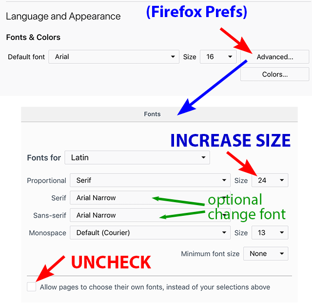
| Possible kludge workaround is to go into the browser preferences, find where
you can adjust the fonts and sizes. Increase the font size. Then there should
be an option to override what the browser specifies. Save those changes. Go back
to browser window and use the control/command-minus keyboard shortcut to zoom-down
the screen. It won't be perfect, but may be somewhat more useable.
|
|
|
|
|
|
|