| Discussion Forum: Thread 230548 |
|
 |
| | | Author: | Teup  | | Posted: | Jan 10, 2018 07:21 | | Subject: | Not happy with instant checkout GUI at all | | Viewed: | 147 times | | Topic: | Suggestions | | Status: | Open | | Vote: | [Yes|No] | |
|
| Instant checkout is great and I am glad we have it now. However, the interface
side of things is still a drama for me. Sometimes someone helps me out sorting
orders, and I found that I'm unable to explain which orders need to be sorted,
since the new system.
"Sort all order that are 'pending' and updated and do not have the grand
total in bold, AND the ones that are 'ready' ONLY when the grand total
IS bold, AND the ones that are 'paid', unless they have already been
sorted or are being sorted'
I have to explain it over and over and we keep ending up with double sorted orders
sometime. Things used to be easy. pending = sort. updated = sort. ready = sorted.
I can compensate some of it by manually changing the status of the orders to
make it clearer what's to be done, yes, that solves part of it. It is just
that it is a bit more mistake-prone than the old system and I have to frown a
little harder to see what's up with the shop than I used to. The inconvenience
is not massive but it is one that persists day after day, and it is an unnecessary
one. Therefore, I think something should change.
I wish that either option of these would be implemented:
1. Do not auto change the status of orders to "ready" when instant checkout is
being used. Let sellers use this to indicate the order really IS ready. All received
orders are always "pending". (And while we're at it, better yet: Do not send
invoices automatically. The majority of webstores I know do not do this. BO also
does not do this. Please let me make my invoices manually. The ones Bricklink
generates are a redundant mix of payment instruction and order confirmation,
both of which already exist)
2. Add a check or other object to indicate SORT and SORTED. How about a red square
meaning SORT that appears by default when the order is placed (paid or not paid),
green when you tap it once meaning SORTED, and orange when tapped again meaning
DO NOT SORT for whatever reason.
I am aware you can split payment and order status. However, my screen is already
too wide as it is, and it involves alot more clicking. Also, I do not want another
status in the list. Just some way purely for the seller's side to have clear
administration about their tasks.
|
|
|
| | | | | |
| | | | | Author: | Teup | | Posted: | Jan 10, 2018 10:34 | | Subject: | Re: Not happy with instant checkout GUI at all | | Viewed: | 38 times | | Topic: | Suggestions | |
|
| In Suggestions, Teup writes:
| | Instant checkout is great and I am glad we have it now. However, the interface
side of things is still a drama for me. Sometimes someone helps me out sorting
orders, and I found that I'm unable to explain which orders need to be sorted,
since the new system.
"Sort all order that are 'pending' and updated and do not have the grand
total in bold, AND the ones that are 'ready' ONLY when the grand total
IS bold, AND the ones that are 'paid', unless they have already been
sorted or are being sorted'
I have to explain it over and over and we keep ending up with double sorted orders
sometime. Things used to be easy. pending = sort. updated = sort. ready = sorted.
I can compensate some of it by manually changing the status of the orders to
make it clearer what's to be done, yes, that solves part of it. It is just
that it is a bit more mistake-prone than the old system and I have to frown a
little harder to see what's up with the shop than I used to. The inconvenience
is not massive but it is one that persists day after day, and it is an unnecessary
one. Therefore, I think something should change.
I wish that either option of these would be implemented:
1. Do not auto change the status of orders to "ready" when instant checkout is
being used. Let sellers use this to indicate the order really IS ready. All received
orders are always "pending". (And while we're at it, better yet: Do not send
invoices automatically. The majority of webstores I know do not do this. BO also
does not do this. Please let me make my invoices manually. The ones Bricklink
generates are a redundant mix of payment instruction and order confirmation,
both of which already exist)
2. Add a check or other object to indicate SORT and SORTED. How about a red square
meaning SORT that appears by default when the order is placed (paid or not paid),
green when you tap it once meaning SORTED, and orange when tapped again meaning
DO NOT SORT for whatever reason.
I am aware you can split payment and order status. However, my screen is already
too wide as it is, and it involves alot more clicking. Also, I do not want another
status in the list. Just some way purely for the seller's side to have clear
administration about their tasks.
|
No responses yet? I find it a small but crucial point. Even just now I was staring
at my list of received orders for 10 sec to make sure that there is nothing I
need to do for an order in the list that I overlooked. Things used to be much
clearer before instant checkout. Just spot anything "pending" and "updated",
sort it, put it on ready. Instead of checking out which "ready"-order really
is ready and requires action from the buyers side and, and which "ready" order
isn't actually ready and requires me to sort it.
|
|
|
| | | | | | | | | |
| | | | | | | Author: | bricksinbins | | Posted: | Jan 10, 2018 11:44 | | Subject: | Re: Not happy with instant checkout GUI at all | | Viewed: | 32 times | | Topic: | Suggestions | |
|
| There is definitely room for a lot of improvements. Much of the site is plagued
with "developer UI". Things work (mostly) but it's all very inefficient to
use and far from practical. This is usually the result of the developers not
actually using what they make. I have seen this in other fields of software development
also.
BL management overall seem very disinterested in improving things. New half baked
stuff is being added and then mostly left like that. IC, as an example, still
needs many fixes and improvements but no sign from BL that they will address
the problems.
| |
No responses yet? I find it a small but crucial point. Even just now I was staring
at my list of received orders for 10 sec to make sure that there is nothing I
need to do for an order in the list that I overlooked. Things used to be much
clearer before instant checkout. Just spot anything "pending" and "updated",
sort it, put it on ready. Instead of checking out which "ready"-order really
is ready and requires action from the buyers side and, and which "ready" order
isn't actually ready and requires me to sort it.
|
|
|
|
| | | | | |
| | | | | Author: | qwertyboy | | Posted: | Jan 10, 2018 11:15 | | Subject: | Re: Not happy with instant checkout GUI at all | | Viewed: | 31 times | | Topic: | Suggestions | |
|
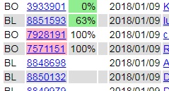
| BL could definitely use some more features when it comes to picking orders. I
have written some in-house stuff that helps us with this.
- When picking an item for an order, you can click on the item to indicate this
lot was picked. The system keeps track of how far in you are by showing a "percentage
complete" on our orders overview, as shown in the first pic. Note that this info
is stored in a local database (per order item, and per order), so you can take
a break and pick up where you have left, even on a different computer.
- The second pic shows part of the screen while picking an order. At the top
right the page always shows the nr of lots in the order, the nr of lots not picked
yet (white), the lots picked (green), lots with an issue (red), and lots verified
during packing for shipping (blue). The "back" is to force a reload of the orders
page (a click on the browser's back button would show a not-updated order
list again), and "up" / "down" goes to the next / previous order in the list.
- When you click on the item picture, a popup comes up that shows some details
about the lot. Here you can add a comment to a lot which will show at the bottom
of the order page.
- When you click on the "Inventory" button in that popup, another popup shows
the sales and inventory for that part for all colors we have or sold. This way,
when picking an item, we can easily check (and correct) the inventory for all
colors.
- It also shows a "diff" for each part/color that will show all the inventory
changes for that item in a separate browser window. the "PG" link opens a price
guide for that item.
There are several other features in these order pages that I won't go into,
but above features have made our shop run so much better.
This is not something we can easily give to other shops to use, as it uses a
local database and a host of tools and programming languages, all tied to our
local infran and hosted on two Linux servers. For BL to implement this, it would
require some more info to be stored for each order item ("status", and "comment")
and each order. But it shows this can be done.
If BL wants to have a chat with me to see if/how they can improve these tools,
by all means, I am available.
Niek.
|
|
|
|
|
|
|
|


)
)
)
)