| Discussion Forum: Thread 219070 |
|
 |
| | | Author: | bb718989  | | Posted: | Apr 9, 2017 23:19 | | Subject: | Please give the forum a make over. | | Viewed: | 226 times | | Topic: | Suggestions | | Status: | Discarded | |
|
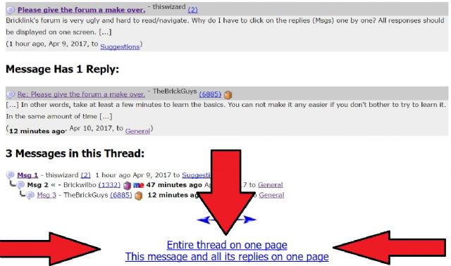
| Bricklink's forum is very ugly and hard to read/navigate. Why do I have to
click on the replies (Msgs) one by one? All responses should be displayed on
one screen. Also what's the point of "RE: what's this?" showing up 17
times in a row on the main page. Each post should only be displayed once. If
it gets a reply, the post should go bold so that readers know there is a new
response. This way the front page isn't spammed to high heaven. Maybe it's
because I'm using my phone? I've never tried on a desktop or laptop.
Anyway, these forums are gross to look at. I can't imagine ever using this
again.
|
|
| | | | | |
| | | | | Author: | Brickwilbo | | Posted: | Apr 10, 2017 00:03 | | Subject: | Re: Please give the forum a make over. | | Viewed: | 73 times | | Topic: | General | |
|
| In Suggestions, thiswizard writes:
| | Bricklink's forum is very ugly and hard to read/navigate. Why do I have to
click on the replies (Msgs) one by one? All responses should be displayed on
one screen.
|
Already possible. Click the balloon or link below the page 'Show entire thread
on 1 page'.
| | Also what's the point of "RE: what's this?" showing up 17
times in a row on the main page. Each post should only be displayed once.
|
Already there. Click the 'Without repliedls' on top of the page.
| | If it gets a reply, the post should go bold so that readers know there is a new
response. This way the front page isn't spammed to high heaven. Maybe it's
because I'm using my phone?
|
Yes it is. Posts change colour when read.
| | I've never tried on a desktop or laptop.
|
Try it. 
| | Anyway, these forums are gross to look at. I can't imagine ever using this
again.
|
|
|
|
| | | | | | | | | |
| | | | | | | Author: | TheBrickGuys | | Posted: | Apr 10, 2017 00:38 | | Subject: | Re: Please give the forum a make over. | | Viewed: | 73 times | | Topic: | General | |
|
| In General, Brickwilbo writes:
| | In Suggestions, thiswizard writes:
| | Bricklink's forum is very ugly and hard to read/navigate. Why do I have to
click on the replies (Msgs) one by one? All responses should be displayed on
one screen.
|
Already possible. Click the balloon or link below the page 'Show entire thread
on 1 page'.
| | Also what's the point of "RE: what's this?" showing up 17
times in a row on the main page. Each post should only be displayed once.
|
Already there. Click the 'Without repliedls' on top of the page.
| | If it gets a reply, the post should go bold so that readers know there is a new
response. This way the front page isn't spammed to high heaven. Maybe it's
because I'm using my phone?
|
Yes it is. Posts change colour when read.
| | I've never tried on a desktop or laptop.
|
Try it.
| | Anyway, these forums are gross to look at. I can't imagine ever using this
again.
|
|
In other words, take at least a few minutes to learn the basics. You can not
make it any easier if you don't bother to try to learn it. In the same amount
of time it took you to complain how difficult the forum is to navigate and to
say you will probably never use it again, if instead you took that time and used
it to hit a few buttons, tap a few links, etc, you would have learned that it
already IS EASY to use.
Jim.
Jim
|
|
|
| | | | | | | | | | | | | |
| | | | | | | | | Author: | tweegster | | Posted: | Apr 10, 2017 00:56 | | Subject: | Re: Please give the forum a make over. | | Viewed: | 65 times | | Topic: | General | |
|
|  |
|
|
| | | | | | | | | | | | | | | | | |
| | | | | | | | | | | Author: | legoman77 | | Posted: | Apr 10, 2017 01:00 | | Subject: | Re: Please give the forum a make over. | | Viewed: | 73 times | | Topic: | General | |
|
| In General, tweegster writes:
I like that.
John P
|
|
| | | | | | | | | | | | | |
| | | | | | | | | Author: | Steineflut | | Posted: | Apr 10, 2017 05:29 | | Subject: | Re: Please give the forum a make over. | | Viewed: | 64 times | | Topic: | General | |
|
| In General, TheBrickGuys writes:
| |
In other words, take at least a few minutes to learn the basics. You can not
make it any easier if you don't bother to try to learn it. In the same amount
of time it took you to complain how difficult the forum is to navigate and to
say you will probably never use it again, if instead you took that time and used
it to hit a few buttons, tap a few links, etc, you would have learned that it
already IS EASY to use.
Jim.
Jim
|
Okay, I get how we all love that nothing ever changes and that we love to keep
stuff the way it is but seriously, the guy is absolutely right!!!
And I am sure that this is the reason why there are about 100 people in this
forum when the site is used by thousands!
Even though you can click on a million buttons to make it look like you want
it to, it should look like that from the start and not with clicking links on
the bottom of a page every single time you want to read something.
The studio beta forum is what a normal forum should look like. It's been
invented... probably about 25 years ago!
- Nadine
|
|
|
| | | | | | | | | | | | | | | | | |
| | | | | | | | | | | Author: | TheBrickGuys | | Posted: | Apr 10, 2017 11:58 | | Subject: | Re: Please give the forum a make over. | | Viewed: | 72 times | | Topic: | General | |
|
| In General, Steineflut writes:
| | In General, TheBrickGuys writes:
| |
In other words, take at least a few minutes to learn the basics. You can not
make it any easier if you don't bother to try to learn it. In the same amount
of time it took you to complain how difficult the forum is to navigate and to
say you will probably never use it again, if instead you took that time and used
it to hit a few buttons, tap a few links, etc, you would have learned that it
already IS EASY to use.
Jim.
Jim
|
Okay, I get how we all love that nothing ever changes and that we love to keep
stuff the way it is but seriously, the guy is absolutely right!!!
And I am sure that this is the reason why there are about 100 people in this
forum when the site is used by thousands!
Even though you can click on a million buttons to make it look like you want
it to, it should look like that from the start and not with clicking links on
the bottom of a page every single time you want to read something.
The studio beta forum is what a normal forum should look like. It's been
invented... probably about 25 years ago!
- Nadine
|
All you have to do is set up a page with the setting you like and then save it
as a favorite up on your favorites bar and you wont have to keep clicking on
the options. Just do it once and all is well.
As far as changing the way it looks, I am all for that. I love the changes BL
has done so far. The only reason I kind of got on the guys case was because he
was complaining (with more of an attitude) about things that need to be changed
but was not even willing to see if the options he wanted already existed. He
complained even before he took just a couple of minutes to learn what options
existed.
Jim
|
|
|
|
|
|
|