|
 |
| | | Author: | Nigel_Hill  | | Posted: | Aug 22, 2015 18:29 | | Subject: | Changes to catalog part view are terrible. | | Viewed: | 256 times | | Topic: | Suggestions | | Status: | Implemented | |
|
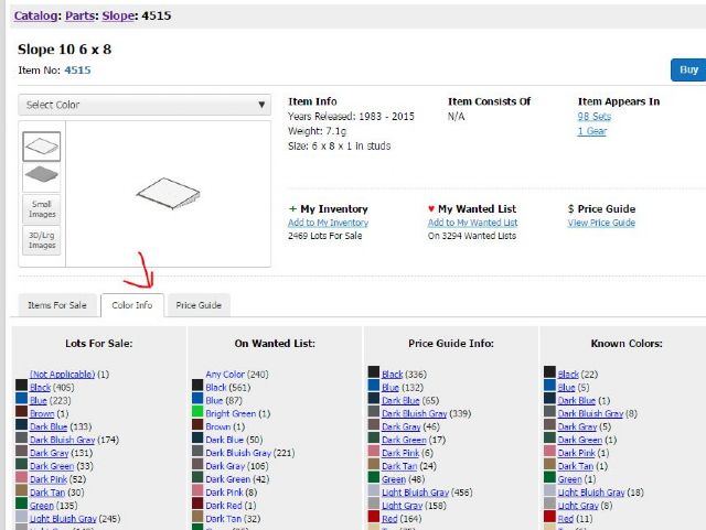
| Hi. I'm sorry to be so negative but the changes to the catalog's part
view page are TERRIBLE.
I buy on BrickLink, I sell on BrickLink, but BrickLink is also an invaluable
resource when building. I need to be able to look up a part and see at a glance
the whole list of known colours and what ones are currently being sold. It is
really not acceptable to load the page and then have to click a drop down list
to see colors, then click known colors, then scroll just to see what those are,
and then have to do more work to see what is being sold of each. It's really,
really, really not useful compared to the old page layout. The old page layout
had this visible immediately when the part page loaded.
Please change this back as soon as possible. There should be a list of all known
colors and a list of all colors for sale at a minimum. This is important because
there may be known colors of some parts but they aren't for sale.
Also, it's generally bad idea in UI design to use a drop down list with more
than 8 or so options. If this cannot be changed back then the drop down list
should at least be made bigger so you don't have to scroll.
|
|
|
| | | | | |
| | | | | Author: | BLUSER_476526 | | Posted: | Aug 22, 2015 18:34 | | Subject: | Re: Changes to catalog part view are terrible. | | Viewed: | 42 times | | Topic: | Suggestions | |
|
| In Problem, Nigel_Hill writes:
| | Hi. I'm sorry to be so negative but the changes to the catalog's part
view page are TERRIBLE.
I buy on BrickLink, I sell on BrickLink, but BrickLink is also an invaluable
resource when building. I need to be able to look up a part and see at a glance
the whole list of known colours and what ones are currently being sold. It is
really not acceptable to load the page and then have to click a drop down list
to see colors, then click known colors, then scroll just to see what those are,
and then have to do more work to see what is being sold of each. It's really,
really, really not useful compared to the old page layout. The old page layout
had this visible immediately when the part page loaded.
Please change this back as soon as possible. There should be a list of all known
colors and a list of all colors for sale at a minimum. This is important because
there may be known colors of some parts but they aren't for sale.
Also, it's generally bad idea in UI design to use a drop down list with more
than 8 or so options. If this cannot be changed back then the drop down list
should at least be made bigger so you don't have to scroll.
|
Hear, hear...I completely agree..
|
|
|
| | | | | |
| | | | | Author: | blackballoon | | Posted: | Aug 22, 2015 18:35 | | Subject: | Re: Changes to catalog part view are terrible. | | Viewed: | 42 times | | Topic: | Suggestions | |
|
| In Problem, Nigel_Hill writes:
| | Hi. I'm sorry to be so negative but the changes to the catalog's part
view page are TERRIBLE.
I buy on BrickLink, I sell on BrickLink, but BrickLink is also an invaluable
resource when building. I need to be able to look up a part and see at a glance
the whole list of known colours and what ones are currently being sold. It is
really not acceptable to load the page and then have to click a drop down list
to see colors, then click known colors, then scroll just to see what those are,
and then have to do more work to see what is being sold of each. It's really,
really, really not useful compared to the old page layout. The old page layout
had this visible immediately when the part page loaded.
Please change this back as soon as possible. There should be a list of all known
colors and a list of all colors for sale at a minimum. This is important because
there may be known colors of some parts but they aren't for sale.
Also, it's generally bad idea in UI design to use a drop down list with more
than 8 or so options. If this cannot be changed back then the drop down list
should at least be made bigger so you don't have to scroll.
|
That is true but if they left it the old way then it would be too easy
|
|
|
| | | | | | | | | |
| | | | | | | Author: | blackballoon | | Posted: | Aug 22, 2015 18:37 | | Subject: | Re: Changes to catalog part view are terrible. | | Viewed: | 46 times | | Topic: | Suggestions | |
|
| In Problem, blackballoon writes:
| | In Problem, Nigel_Hill writes:
| | Hi. I'm sorry to be so negative but the changes to the catalog's part
view page are TERRIBLE.
I buy on BrickLink, I sell on BrickLink, but BrickLink is also an invaluable
resource when building. I need to be able to look up a part and see at a glance
the whole list of known colours and what ones are currently being sold. It is
really not acceptable to load the page and then have to click a drop down list
to see colors, then click known colors, then scroll just to see what those are,
and then have to do more work to see what is being sold of each. It's really,
really, really not useful compared to the old page layout. The old page layout
had this visible immediately when the part page loaded.
Please change this back as soon as possible. There should be a list of all known
colors and a list of all colors for sale at a minimum. This is important because
there may be known colors of some parts but they aren't for sale.
Also, it's generally bad idea in UI design to use a drop down list with more
than 8 or so options. If this cannot be changed back then the drop down list
should at least be made bigger so you don't have to scroll.
|
That is true but if they left it the old way then it would be too easy
|
Also they have to keep all those developers busy somehow. They are not cheap
you know
|
|
|
| | | | | |
| | | | | Author: | Miro78 | | Posted: | Aug 22, 2015 18:36 | | Subject: | Re: Changes to catalog part view are terrible. | | Viewed: | 49 times | | Topic: | Suggestions | |
|
| In Problem, Nigel_Hill writes:
| | Hi. I'm sorry to be so negative but the changes to the catalog's part
view page are TERRIBLE.
I buy on BrickLink, I sell on BrickLink, but BrickLink is also an invaluable
resource when building. I need to be able to look up a part and see at a glance
the whole list of known colours and what ones are currently being sold. It is
really not acceptable to load the page and then have to click a drop down list
to see colors, then click known colors, then scroll just to see what those are,
and then have to do more work to see what is being sold of each. It's really,
really, really not useful compared to the old page layout. The old page layout
had this visible immediately when the part page loaded.
Please change this back as soon as possible. There should be a list of all known
colors and a list of all colors for sale at a minimum. This is important because
there may be known colors of some parts but they aren't for sale.
Also, it's generally bad idea in UI design to use a drop down list with more
than 8 or so options. If this cannot be changed back then the drop down list
should at least be made bigger so you don't have to scroll.
|
I just posted this as a reply in a different thread, but I will echo this change
as a TERRIBLE idea. From a builder's point of view, it makes designing a
build with parts that are available nearly impossible to the point where it's
just not worth even starting. BL please understand that more clicks than previous
version is worse for the experience. Nobody wants to spend any more time on BL
to get their research/browsing of parts done than is necessary. I want to get
to building and not wasting time.
Sorry to sound negative as well, but this was a huge blow to the catalog experience.
Miro
|
|
|
| | | | | |
| | | | | Author: | re_collection | | Posted: | Aug 22, 2015 18:40 | | Subject: | Re: Changes to catalog part view are terrible. | | Viewed: | 47 times | | Topic: | Suggestions | |
|
| In Problem, Nigel_Hill writes:
| | Hi. I'm sorry to be so negative but the changes to the catalog's part
view page are TERRIBLE.
|
They are worse than terrible, I don't find the right words in english language...
maybe because I don't know english swear words 
| |
I buy on BrickLink, I sell on BrickLink, but BrickLink is also an invaluable
resource when building. I need to be able to look up a part and see at a glance
the whole list of known colours and what ones are currently being sold. It is
really not acceptable to load the page and then have to click a drop down list
to see colors, then click known colors, then scroll just to see what those are,
and then have to do more work to see what is being sold of each. It's really,
really, really not useful compared to the old page layout. The old page layout
had this visible immediately when the part page loaded.
Please change this back as soon as possible. There should be a list of all known
colors and a list of all colors for sale at a minimum. This is important because
there may be known colors of some parts but they aren't for sale.
Also, it's generally bad idea in UI design to use a drop down list with more
than 8 or so options. If this cannot be changed back then the drop down list
should at least be made bigger so you don't have to scroll.
|
|
|
|
| | | | | |
| | | | | Author: | kidsncritters | | Posted: | Aug 22, 2015 18:46 | | Subject: | Re: Changes to catalog part view are terrible. | | Viewed: | 36 times | | Topic: | Problem | |
|
| I was wondering what all the fuss was about - then I looked on the part detail
page...
NO TABS at the bottom!
I thought it was a great idea to have the tabs there!
|
|
| | | | | |
| | | | | Author: | viejos | | Posted: | Aug 22, 2015 18:46 | | Subject: | Re: Changes to catalog part view are terrible. | | Viewed: | 66 times | | Topic: | Suggestions | |
|
| In Suggestions, Nigel_Hill writes:
| | Hi. I'm sorry to be so negative but the changes to the catalog's part
view page are TERRIBLE.
I buy on BrickLink, I sell on BrickLink, but BrickLink is also an invaluable
resource when building. I need to be able to look up a part and see at a glance
the whole list of known colours and what ones are currently being sold. It is
really not acceptable to load the page and then have to click a drop down list
to see colors, then click known colors, then scroll just to see what those are,
and then have to do more work to see what is being sold of each. It's really,
really, really not useful compared to the old page layout. The old page layout
had this visible immediately when the part page loaded.
Please change this back as soon as possible. There should be a list of all known
colors and a list of all colors for sale at a minimum. This is important because
there may be known colors of some parts but they aren't for sale.
Also, it's generally bad idea in UI design to use a drop down list with more
than 8 or so options. If this cannot be changed back then the drop down list
should at least be made bigger so you don't have to scroll.
|
I switched this to a suggestion so people could vote. I say, bring back the colors.
|
|
|
| | | | | | | | | |
| | | | | | | Author: | JulieK | | Posted: | Aug 22, 2015 18:52 | | Subject: | (Cancelled) | | Viewed: | 43 times | | Topic: | Suggestions | |
|
| | (Cancelled) |
|
| | | | | | | | | |
| | | | | | | Author: | JulieK | | Posted: | Aug 22, 2015 18:59 | | Subject: | Re: Changes to catalog part view are terrible. | | Viewed: | 52 times | | Topic: | Suggestions | |
|
| In Suggestions, viejos writes:
| | In Suggestions, Nigel_Hill writes:
| | Hi. I'm sorry to be so negative but the changes to the catalog's part
view page are TERRIBLE.
I buy on BrickLink, I sell on BrickLink, but BrickLink is also an invaluable
resource when building. I need to be able to look up a part and see at a glance
the whole list of known colours and what ones are currently being sold. It is
really not acceptable to load the page and then have to click a drop down list
to see colors, then click known colors, then scroll just to see what those are,
and then have to do more work to see what is being sold of each. It's really,
really, really not useful compared to the old page layout. The old page layout
had this visible immediately when the part page loaded.
Please change this back as soon as possible. There should be a list of all known
colors and a list of all colors for sale at a minimum. This is important because
there may be known colors of some parts but they aren't for sale.
Also, it's generally bad idea in UI design to use a drop down list with more
than 8 or so options. If this cannot be changed back then the drop down list
should at least be made bigger so you don't have to scroll.
|
I switched this to a suggestion so people could vote. I say, bring back the colors.
|
Voted YES. Also sent an email to the bugs email. Maybe if enough emails come
into the bugs account the bat phone will go off. I'm not sure if anyone is
on duty over the weekend. I'm thinking no since no one has come on the forum
to address this mess.
Julie
|
|
|
| | | | | | | | | |
| | | | | | | Author: | 62Bricks | | Posted: | Aug 22, 2015 19:18 | | Subject: | Re: Changes to catalog part view are terrible. | | Viewed: | 43 times | | Topic: | Suggestions | |
|
| In Suggestions, viejos writes:
| | In Suggestions, Nigel_Hill writes:
| | Hi. I'm sorry to be so negative but the changes to the catalog's part
view page are TERRIBLE.
I buy on BrickLink, I sell on BrickLink, but BrickLink is also an invaluable
resource when building. I need to be able to look up a part and see at a glance
the whole list of known colours and what ones are currently being sold. It is
really not acceptable to load the page and then have to click a drop down list
to see colors, then click known colors, then scroll just to see what those are,
and then have to do more work to see what is being sold of each. It's really,
really, really not useful compared to the old page layout. The old page layout
had this visible immediately when the part page loaded.
Please change this back as soon as possible. There should be a list of all known
colors and a list of all colors for sale at a minimum. This is important because
there may be known colors of some parts but they aren't for sale.
Also, it's generally bad idea in UI design to use a drop down list with more
than 8 or so options. If this cannot be changed back then the drop down list
should at least be made bigger so you don't have to scroll.
|
I switched this to a suggestion so people could vote. I say, bring back the colors.
|
Has it been established that this is a format change and not just a bug or a
temporary experiment? The tabs are still coded into the pages, they just aren't
being displayed. If you are handy with Firefox and CSS you can get them back.
Makes me think it's not a permanent format change.
|
|
|
| | | | | | | | | | | | | |
| | | | | | | | | Author: | enig | | Posted: | Aug 22, 2015 19:23 | | Subject: | Re: Changes to catalog part view are terrible. | | Viewed: | 53 times | | Topic: | Suggestions | |
|
| In Suggestions, 62Bricks writes:
| | In Suggestions, viejos writes:
| | In Suggestions, Nigel_Hill writes:
| | Hi. I'm sorry to be so negative but the changes to the catalog's part
view page are TERRIBLE.
I buy on BrickLink, I sell on BrickLink, but BrickLink is also an invaluable
resource when building. I need to be able to look up a part and see at a glance
the whole list of known colours and what ones are currently being sold. It is
really not acceptable to load the page and then have to click a drop down list
to see colors, then click known colors, then scroll just to see what those are,
and then have to do more work to see what is being sold of each. It's really,
really, really not useful compared to the old page layout. The old page layout
had this visible immediately when the part page loaded.
Please change this back as soon as possible. There should be a list of all known
colors and a list of all colors for sale at a minimum. This is important because
there may be known colors of some parts but they aren't for sale.
Also, it's generally bad idea in UI design to use a drop down list with more
than 8 or so options. If this cannot be changed back then the drop down list
should at least be made bigger so you don't have to scroll.
|
I switched this to a suggestion so people could vote. I say, bring back the colors.
|
Has it been established that this is a format change and not just a bug or a
temporary experiment? The tabs are still coded into the pages, they just aren't
being displayed. If you are handy with Firefox and CSS you can get them back.
Makes me think it's not a permanent format change.
|
That's what I am thinking too. This must be an error.
|
|
|
| | | | | | | | | | | | | | | | | |
| | | | | | | | | | | Author: | BLUSER_369442 | | Posted: | Aug 22, 2015 19:48 | | Subject: | Re: Changes to catalog part view are terrible. | | Viewed: | 45 times | | Topic: | Suggestions | |
|
| In Suggestions, enig writes:
| | In Suggestions, 62Bricks writes:
| | In Suggestions, viejos writes:
| | In Suggestions, Nigel_Hill writes:
| | Hi. I'm sorry to be so negative but the changes to the catalog's part
view page are TERRIBLE.
I buy on BrickLink, I sell on BrickLink, but BrickLink is also an invaluable
resource when building. I need to be able to look up a part and see at a glance
the whole list of known colours and what ones are currently being sold. It is
really not acceptable to load the page and then have to click a drop down list
to see colors, then click known colors, then scroll just to see what those are,
and then have to do more work to see what is being sold of each. It's really,
really, really not useful compared to the old page layout. The old page layout
had this visible immediately when the part page loaded.
Please change this back as soon as possible. There should be a list of all known
colors and a list of all colors for sale at a minimum. This is important because
there may be known colors of some parts but they aren't for sale.
Also, it's generally bad idea in UI design to use a drop down list with more
than 8 or so options. If this cannot be changed back then the drop down list
should at least be made bigger so you don't have to scroll.
|
I switched this to a suggestion so people could vote. I say, bring back the colors.
|
Has it been established that this is a format change and not just a bug or a
temporary experiment? The tabs are still coded into the pages, they just aren't
being displayed. If you are handy with Firefox and CSS you can get them back.
Makes me think it's not a permanent format change.
|
That's what I am thinking too. This must be an error.
|
Also, once you get the lots for sale listings to show, some of the filters are
broken: "ship to" only gives the option of "anywhere" and the "more options"
filters won't show at all.
Browser console shows that it's getting a 404 when it tries to load currencyVars.js,
causing an error when it tries to access the currency list. Maybe that's
short-circuiting the javascript that's supposed to show the tabs.
Bad coding, though. A properly built page would still work even if javascript
fails or is turned off. Someone needs to teach the BL dev team the principle
of PROGRESSIVE ENHANCEMENT.
But I voted YES anyway, just in case this was a deliberate change.
|
|
|
| | | | | | | | | | | | | | | | | | | | | |
| | | | | | | | | | | | | Author: | BLUSER_369442 | | Posted: | Aug 22, 2015 19:59 | | Subject: | Re: Changes to catalog part view are terrible. | | Viewed: | 46 times | | Topic: | Suggestions | |
|
| In Suggestions, Ryukage writes:
| | In Suggestions, enig writes:
| | In Suggestions, 62Bricks writes:
| | In Suggestions, viejos writes:
| | In Suggestions, Nigel_Hill writes:
| | Hi. I'm sorry to be so negative but the changes to the catalog's part
view page are TERRIBLE.
I buy on BrickLink, I sell on BrickLink, but BrickLink is also an invaluable
resource when building. I need to be able to look up a part and see at a glance
the whole list of known colours and what ones are currently being sold. It is
really not acceptable to load the page and then have to click a drop down list
to see colors, then click known colors, then scroll just to see what those are,
and then have to do more work to see what is being sold of each. It's really,
really, really not useful compared to the old page layout. The old page layout
had this visible immediately when the part page loaded.
Please change this back as soon as possible. There should be a list of all known
colors and a list of all colors for sale at a minimum. This is important because
there may be known colors of some parts but they aren't for sale.
Also, it's generally bad idea in UI design to use a drop down list with more
than 8 or so options. If this cannot be changed back then the drop down list
should at least be made bigger so you don't have to scroll.
|
I switched this to a suggestion so people could vote. I say, bring back the colors.
|
Has it been established that this is a format change and not just a bug or a
temporary experiment? The tabs are still coded into the pages, they just aren't
being displayed. If you are handy with Firefox and CSS you can get them back.
Makes me think it's not a permanent format change.
|
That's what I am thinking too. This must be an error.
|
Also, once you get the lots for sale listings to show, some of the filters are
broken: "ship to" only gives the option of "anywhere" and the "more options"
filters won't show at all.
Browser console shows that it's getting a 404 when it tries to load currencyVars.js,
causing an error when it tries to access the currency list. Maybe that's
short-circuiting the javascript that's supposed to show the tabs.
Bad coding, though. A properly built page would still work even if javascript
fails or is turned off. Someone needs to teach the BL dev team the principle
of PROGRESSIVE ENHANCEMENT.
But I voted YES anyway, just in case this was a deliberate change.
|
Oh, it looks like categoryVars.js is also 404'ing. That's not causing
any errors to appear on the console, but judging from the filename, it's
an even better candidate for breaking something.
|
|
|
| | | | | | | | | | | | | |
| | | | | | | | | Author: | Miro78 | | Posted: | Aug 22, 2015 19:41 | | Subject: | Re: Changes to catalog part view are terrible. | | Viewed: | 40 times | | Topic: | Suggestions | |
|
| In Suggestions, 62Bricks writes:
| | In Suggestions, viejos writes:
| | In Suggestions, Nigel_Hill writes:
| | Hi. I'm sorry to be so negative but the changes to the catalog's part
view page are TERRIBLE.
I buy on BrickLink, I sell on BrickLink, but BrickLink is also an invaluable
resource when building. I need to be able to look up a part and see at a glance
the whole list of known colours and what ones are currently being sold. It is
really not acceptable to load the page and then have to click a drop down list
to see colors, then click known colors, then scroll just to see what those are,
and then have to do more work to see what is being sold of each. It's really,
really, really not useful compared to the old page layout. The old page layout
had this visible immediately when the part page loaded.
Please change this back as soon as possible. There should be a list of all known
colors and a list of all colors for sale at a minimum. This is important because
there may be known colors of some parts but they aren't for sale.
Also, it's generally bad idea in UI design to use a drop down list with more
than 8 or so options. If this cannot be changed back then the drop down list
should at least be made bigger so you don't have to scroll.
|
I switched this to a suggestion so people could vote. I say, bring back the colors.
|
Has it been established that this is a format change and not just a bug or a
temporary experiment? The tabs are still coded into the pages, they just aren't
being displayed. If you are handy with Firefox and CSS you can get them back.
Makes me think it's not a permanent format change.
|
I hope you are right about it. I'll wait and come back when this gets fixed.
I can't do anything useful on Bricklink that I need to do right now.
Miro
|
|
|
| | | | | |
| | | | | Author: | DallasBricks | | Posted: | Aug 22, 2015 19:39 | | Subject: | This is awful Bricklink | | Viewed: | 66 times | | Topic: | Suggestions | |
|
| I believe this is among the worst changes BL has made. PLEASE, PLEASE change
this back to show all color information in the tabs. That was a nice presentation.
David
|
|
| | | | | | |
| | | | | Author: | jonwil | | Posted: | Aug 22, 2015 21:01 | | Subject: | Re: Changes to catalog part view are terrible. | | Viewed: | 50 times | | Topic: | Suggestions | |
|
| I also hate what has happened, I use Bricklink all the time as a reference for
"does part x exist in color y and if so, do I own any of the sets that contain
it" and the changes (intentional or otherwise) make that much harder.
|
|
| | | | | | | | | |
| | | | | | | Author: | Darth_Smithy | | Posted: | Aug 22, 2015 21:32 | | Subject: | Re: Changes to catalog part view are terrible. | | Viewed: | 45 times | | Topic: | Suggestions | |
|
| In Suggestions, jonwil writes:
| | I also hate what has happened, I use Bricklink all the time as a reference for
"does part x exist in color y and if so, do I own any of the sets that contain
it" and the changes (intentional or otherwise) make that much harder.
|
Is there a way to check 'known colors' anymore? I used that a lot.
|
|
| | | | | | | | | | | | | |
| | | | | | | | | Author: | tEoS | | Posted: | Aug 22, 2015 21:35 | | Subject: | Re: Changes to catalog part view are terrible. | | Viewed: | 48 times | | Topic: | Suggestions | |
|
| Here:
| | Is there a way to check 'known colors' anymore? I used that a lot.
|
|
|
|
| | | | | | | | | | | | | | | | | |
| | | | | | | | | | | Author: | Darth_Smithy | | Posted: | Aug 22, 2015 21:38 | | Subject: | Re: Changes to catalog part view are terrible. | | Viewed: | 52 times | | Topic: | Suggestions | |
|
| In Suggestions, tEoS writes:
| | Here:
| | Is there a way to check 'known colors' anymore? I used that a lot.
|
|
Thanks!
|
|
| | | | | | | | | | | | | | | | | |
| | | | | | | | | | | Author: | TheBrickGuys | | Posted: | Aug 23, 2015 00:36 | | Subject: | Re: Changes to catalog part view are terrible. | | Viewed: | 63 times | | Topic: | Suggestions | |
|
| In Suggestions, tEoS writes:
| | Here:
| | Is there a way to check 'known colors' anymore? I used that a lot.
|
|
I dont understand? Like mentioned above, there is a color tab that shows the
available known colors. Or is this problem related with the glitch talked about
above where there were no tabs available so you cant choose the colors tab (I
know I can see the tabs)?
Jim
|
|
| | | | | | | | | | | | | | | | | | | | | |
| | | | | | | | | | | | | Author: | Nigel_Hill | | Posted: | Aug 23, 2015 18:11 | | Subject: | Re: Changes to catalog part view are terrible. | | Viewed: | 41 times | | Topic: | Suggestions | |
|
| In Suggestions, TheBrickGuys writes:
| | In Suggestions, tEoS writes:
| | Here:
| | Is there a way to check 'known colors' anymore? I used that a lot.
|
|
I dont understand? Like mentioned above, there is a color tab that shows the
available known colors. Or is this problem related with the glitch talked about
above where there were no tabs available so you cant choose the colors tab (I
know I can see the tabs)?
Jim
|
It may have been a gitch. All the tabs at the bottom were not loading.
|
|
| | | | | |
| | | | | Author: | fredjh | | Posted: | Aug 22, 2015 21:37 | | Subject: | Re: Changes to catalog part view are terrible. | | Viewed: | 44 times | | Topic: | Suggestions | |
|
| Voted yes... I use those pages for reference all the time. I know it takes compute
time and bandwidth, but I think I've bought enough here that I can look things
up sometimes - and when you have to click on other links to get the data, you
end up using MORE bandwidth.
I'd like to think it's a problem they are already working on, though,
as a lot of my catalog and "all item" searches are often just coming up blank
(not even a "not found" message).
|
|
|
|
|